 |
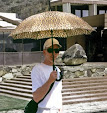
| That's me at the front door. A J. Neel Reid house. |
I just flew low over Atlanta, (via Google Earth), trying to find a house I want to show you. It's a Neel Reid house. A brilliant classicist, Neel Reid, is well known to the landed gentry of Atlanta. I was fortunate to have the opportunity to paint a mural there in 1983 or was it 1984? Doesn't matter, the point is I've got some rather shocking images to show you! Of course the photographs are probably shocking only to me because I can hardly identify what I know to be pictures of me. What was I thinking with those big thick socks and hot pants? Tell me! Fortunately I think the painting I'm doing is not so bad. It was my version of the Chinoiserie in the The Long Gallery at the Royal Pavilion at Brighton. I remember at the time I was so into the Brighton Pavilion. Of course you probably know the Pavilion was built by the Prince Regent whose father was mad King George. Atlanta loves, loves Regency so apparently it rubbed off on me.
 |
| Me painting with spectators |
 |
| I seemed to always be on a ladder |
 |
| Part of my finished work circa 1984 |
So why drudge up this ancient history? I guess it's on my mind because I'll soon be paying a visit to Atlanta. Family will be there and possibly some more painting for me too. Don't worry I promise to keep you in the loop.


that looks incredible (the mural, not the outfit!). I'm sure the family still loves seeing it everytime they walk into the house.
ReplyDeleteThanks! It's so gratifying to work with/on great architectural.
ReplyDeleteBeautiful work and great gams!
ReplyDeleteThanks, Daniel and it's genetic!
ReplyDeleteOh yes---the thick socks and short shorts....well I remember how carefully I'd assemble that outfit...and I barely recognize myself in old pics either--all of a sudden.
ReplyDeleteBut this isn't about me--quite mad for the murals. Great stuff
Here's what's weird: I got over the thick socks shortly after this (I think) then relapsed and again adopted the look in the early 90s. Perhaps I'm some sort of an addict.
ReplyDeleteenough about socks...
Thanks so much for the compliment and camaraderie!
Scott, this is absolutely beautiful. I cannot tell you how much I love this mural! It just goes to show that good design is timeless. I do not know if the house is by Reid but there is a Jobs List in the book J. NEEL REID ARCHITECT by William R. Mitchell Jr. that gives the name of the client and (usually) the address. Terry at the Architectural Tourist blog might know, so I'll send Jim an e-mail. __ The Devoted Classicist
ReplyDeleteMy apologies! Terry Kearns' delightful blog on Atlanta architecture is called Architecture Tourist.
ReplyDeleteThanks John!
ReplyDeleteI so appreciate your compliment interest. I just added the Architectural Tourist to my list. I had seen Terry's blog before but somehow it was not on my list.
It's been decades but I thought the house might be on Habersham Road. Using Google Street view I couldn't find it there. According to my recollection the house wasn't that far off Peachtree and before West Wesley. I used the (Reid)list on Buckhead.net but didn't search every one. Maybe someone with a keen eye will recognize the facade on my blog and enlighten us!
The Reid Jobs List notes the following addresses on Habersham Road NW that cannot be seen as a street view on MapQuest: 2804, 2820, & 2570. (It also notes 2624, a lovely house, but it is seen not to be the one in question). Perhaps an Atlanta reader can help.
ReplyDeleteThe landscaping could have changed but I recall be able to clearly see the house from the street. The porte-cochère (right side)is kind of a distinctive feature. I think the owner was a brain surgeon. I only met the Mrs. and worked through the interior designer, Jim Young (deceased).
ReplyDeleteThis is so beautiful. It looks like such a gracefully proportioned room. Chalk it all up to
ReplyDeletethe 80's! Atlanta will be kind-I've no doubt.
It's the entrance hall and yes, beautiful proportions and look at those moldings!
ReplyDeleteWell, Scott, I've been visiting this posting for the longest time, wishing that I could view your technique up close, like the young man in the second frame. And I've concluded that you've reincarnated from a relatively recent life as John Nash. Didn't you do palms in the Royal Pavilion at Brighton?
ReplyDeleteThanks and sorry. I know I need to come up with a new blog entry. This project is so old and was not well documented.
ReplyDeleteP.s. I'm about to travel and will return with new imagery.
The house in question is my own. I bought it in 2009 from the second family to own the home since its construction in 1927. It's amazing what a Google search will produce. Sadly, your work of genius is no longer on the walls of the entrance / main hall. The home underwent a significant cosmetic makeover the year I purchased the home. It's been incredible to see photos of the home some 25+ years ago.
ReplyDeleteEthan! So glad to hear from you.
ReplyDelete