Sunday, December 26, 2010

Walking On Thin Ice


Lake Michigan from the penthouse.


The Navy Pier, another view from the penthouse.

The exterior of 840 Lake Shore Drive.


I might also be dreaming of a boat to help me out of here, a toyboat. Oh, but that's another Yoko Ono song. I'll stick with the thin ice metaphor especially since many of my readers are literally looking at ice and deciding whether or not to walk on it. If you're an artist it's just what you do. Walking on thin ice.


A part of the hall in between my two paintings.
Check it out. (If you can find it!) I'm in Luxe Magazine


My painting in the east rotunda.
The plan view. 


Ok, we're going to Chicago and of course this was winter so all this was ice. Even before I left Los Angeles I knew what I was going to paint but I'd never been to Chicago so I had to go and see the lake. The water, the melting ice, and the fog all blending just as I imagined it. Well, I'm a student of Whistler, don't you know?

My original Photoshop collage proposal.


Warming it up.
My maquette: it was sent to Chicago and returned a little mangled but you get the idea.

Looking into my maquette.


Everyone one of my projects is unique to its placement. I have to think I bring a fresh perspective, an outsider's eyes to the far flung locations where my work resides. Perhaps knowing my time there is brief I quickly distill the essence and serve it up. 

Studio view, Culver City.
The installation process.


On the left, looking east. On the right, looking west.
840 Lake Shore Drive penthouse floor plan.
My work is in the center hallway (in yellow).
My east rotunda painting is the little oval on the right. (see above)
My west rotunda painting is the little circle on the left. (see below)


On the other hand my clients deserve a lot of credit because I'm creating something they've never seen before. That's a leap of faith. Thank you Kara and Jessica! Jessica LaGrange came back to me a second time when her client took the rest of the floor in the building designed by her husband. This time prairie was the inspiration or was it Rothko

Prairie


My original proposal for the west rotunda.
My painted maquette for the west rotunda painting
Studio view, Los Angeles. The prairie abstracted.

My installed work, the west rotunda, a Chicago penthouse,
840 Lakes Shore Drive.


See you in the prairie, on the water, and wherever, until next time. 


Friday, December 24, 2010

Tis The Season


Oh yes, tis the season of the sensual world and to prove it I bring you cell phone photos and text from my visit to the Resnick Pavillion at LACMA.

The latest building addition to LACMA has been reviewed elsewhere and so I'm not going to do that here. Nor am I going to give a complete run down of the installation which is a whirlwind mix of cultures and art forms. I went through the brilliant and fascinating costume collection and came out of that space to see this wonderful mural fragment. It was only then that I wished I'd brought a camera. Oh but that's what cell phones are for, right?


      The mural on the west wall of Structure 1 depicts the ceremonies associated with the coronation of an early Maya king at San Bartolo. Originally painted on the room's upper register, the mural measures about 33 inches high and it was partially destroyed when the Maya built over it. According to the team led by William Saturno, Karl Taube, and David Stuart, and the documention by Heather Hurst, this sequence records the birth, death, and resurrection of the Maya maize god. A Maya figure, carrying an Olmec-style baby representing the infant maize god god, strides toward a profile turtle head attached to a lobed body that contains threee dieties. One sits on a throne; the other is seated on a jaguar-pelt cushion. Their arms extend toward the adult maize god, who is shown dancing and beating on a turtle shell drum with an antler.
      The Olmec-style baby in this narrative indicates the familiarity of the early Maya with these ancestral traditions.


Thank you Heather Hurst!  Heather is the scientist/artist responsible for this mural fragment and much more documentation of Mayan culture. It's so brilliant I can hardly stand it. Here again I present proof of the dynamic enlightening and enigmatic qualities of the painted wall. I need it, you need, we have to have it. Now excuse my laziness but I thought the description provided was succinct and interesting as is so I give it to you thusly.


Mexico, Guerrero, Oxtotitlan Cave, c. 900-700 BC
Mineral pigments
Replica painted by John M.D. Pohl, Wendy Phillips, and Isabel Ramirez


Yes, there's more: another mural, also bizarre and beautiful. And you've got the Resnicks' dodads and whatnots. I've only incuded one object in the Eye for the Sensual exhibit, a fine grisaille rondel. Apparently given the choice I'm more drawn to the primitive. On the other hand the painting subject is a celebration of the primitive so there you have it,  I am consistent. Please enjoy and prosper in the new year with my best regards.


Yours truly,

Scott Waterman

Saturday, December 11, 2010

Continental


It's an old fashion term meant to connote sophistication and whatever goes with that. It's also meant Europe but Europe's not what it used to be and these paintings of mine aren't on that continent. They were recently sold to a client in Asia because that's where the action is n'est-ce-pas?

Scott Waterman /2002/ acrylic/unstretched canvas

Scott Waterman /2002/ acrylic/unstretched canvas


This post is kind of rushing it because I really don't have anything but these quick snapshots of the installation. Better images will follow I hope. I just want to make sure my readers were kept on their toes with no idea what I might paint or post next.


Is it working? Are you in toe stand?

Thank you and be seeing you.

Attention! Update! This project has been published. Please see my new post which includes a link to the online version of Interiors Magazine.

http://corbuscave.blogspot.com/2011/10/all-in-family.html

Friday, December 10, 2010

More Songs About Books And Mags


As usual you really should click on the images to ENLARGE.


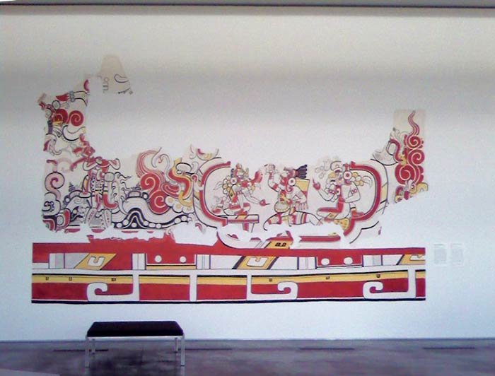
Are you following me? You remember the forced perspective trompe l'oeil mural in my last post? Yes, the one published in Trompe L'Oeil At Home. Well what I didn't tell you is that it had actually been published a few years before in HG (magazine). HG March 1988 was the newly redesigned ( and renamed) House and Garden magazine with its new editor, Anna Wintour. You know, the one who wears Prada? I guess maybe that came after when someone decided she'd be happier at Vogue, strike a pose.


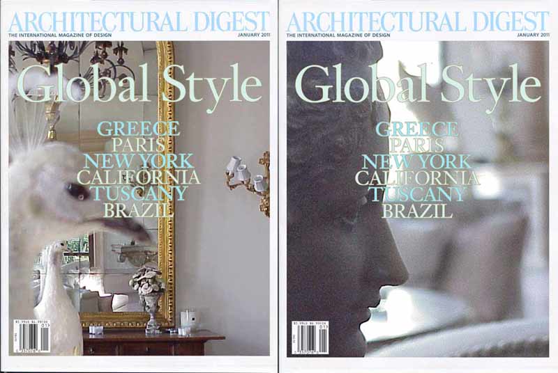
So I was in the first new editor, new look House and Garden and now I'm in the first new editor, new look Architectural Digest. Is there any significance? If there is I hope it's above and beyond the rather obscure and insignificant way that my work is shown in both. Listen. I'm extremely grateful. They spelled my name right but my website, Windsor's website, and  my blog posts show that silver leaf room much more explicitly and deliciously don't you think?

Much of the pond area lives behind a sofa! (detail on right)

I do like the January A.D. cover but permit me to suggest alternatives. Vote for the one you like best and you won't hurt my feelings if you like the original. I probably like it best myself but there's so much of that room that's left out, seems a shame.So I give you more.

Click on Tumblr for more pictures of this and other projects. Thanks!

Comments welcome.
Thank You.

Friday, December 3, 2010

Book Report

Down the rabbit hole you go!

I'm in this book (a lot!)  

Spaces and Illusions, High Museum 1980
(note painted-on-the-wall sofa back)
When I was still a student at The Atlanta College of Art The High Museum created a children's exhibit called Spaces and Illusions. Actually it was Mack Scogin, his associates at Heery and Heery Architects, and volunteers who designed and created the exhibit which was brilliant and trippy. Think Dr. Calgari meets Charles Dodgson. I worked there as a student guide and never tired of it. It was a playful series of chambers, completely thrilling to explore. Also included was a bit of trompe l'oeil painting, a strikingly believable "Hershey bar" and "sofa back" for a couple of examples.

Click on these pages to enlarge
Apparently the idea was planted in my head and soon afterwards I was taking commissions to paint my own versions of fool the eye painting. By the end of the (8os) decade I was sort of "over" it but Karen S. Chambers very kindly included me in her book, Trompe L'Oeil At Home (1991) so my work in that genre/period is nicely documented. Karen flatters me with a visual comparison to Borromini and by using more examples of my work than any other artist in the book. Thanks Karen!

click on these pages to enlarge


Commissions are one thing but would I ever use the technique in my own work? The first thing I thought of was a painting I did in 2001. It's from a series based on images in a little sketch/collage book of mine. Once upon a time my brother sent me a post card from London, I think it's a little bronze in the British Museum. I stuck the card in my book and splashed a little blue watercolor above as a sort of Dada gesture. Years later I retrieved it and reinterpreted it as subject matter blown up.  My 2001 figure series was a mix of ultra flat and space popping images. The truth is I have no allegiance to any sort of technique or subject but teach myself what I want to know.


My Oakland Studio (2001)

What do you know?
Related Posts with Thumbnails