Showing posts with label grisaille. Show all posts

Thursday, March 8, 2018

Los Angeles

Look!


The all-seeing eye: Blade Runner, Warner Bros. 1982 

What the eye sees: Los Angles, the mythical future.

Roger A. Deakins won best cinematography for Blade Runner 2049, deservedly so, probably, though Blade Runner, the original, is simply superior in every way. Every way. Los Angeles is big, a big target, so it’s quite easy to hit. Hit it. What’s more sophisticated is to capture it in an intimate way. And can we have some warmth and wit? Thank you.


There is a city by the sea
A gentle company
I don't suppose you want to
And as it tells its sorry tale
In harrowing detail
Its hollowness will haunt you

Fr: Los Angeles, I'm Yours (from Her Majesty) Colin Meloy


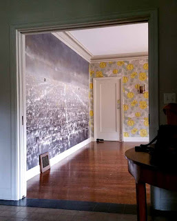
Years ago I began a search on behalf of my power couple clients in charming Hancock Park, (a park-like Los Angeles neighborhood). I was looking for just the right imagery for a dining room mural. I like to make these sorts of projects contextual so I’m thinking: park-like, lots of foliage and bucolic. Alas nothing was sticking. Out of frustration I tried an urban view in which I had no confidence thinking it was not only not the right imagery but also too derivative of Ed Ruscha or Peter Alexander. Surprisingly they seemed to like that idea, still the project was put on the back burner and I thought completely snuffed out. In fact, I learned they’d covered their dining room in a patterned fabric. Years go by, end of story.


My painted sample pinned up for sizing up.

Last Spring, I received word, game on. No, this can’t be, I thought. Paint the urban L.A. view on top of the pattern? Ridiculous. But I went through the motions, made a painted sample and half-way through I could see it. This can work. And so it came to be. A “Little” fugue in G Minor. The yellow flower forms from the patterned fabric peak through here and there and read alternatively as a heavily body or lights from the urban fabric. And the grisaille palette derives from the grey in the substrate. And in fact my painting bears practically no resemblance to anything either Ed Ruscha or Peter Alexander painted. It’s at once abstract and evocative. Los Angeles, I’m yours. 


Addendum

There’s something else really special about this project. I managed to get my very good friend Sue Garner to help me.  So fun.  Sue and I went to art school together and we worked on The Ponce in Atlanta but that’s another blogpost. Be seeing you.


That's Sue, that's me.


Wednesday, April 5, 2017

A Walk in the Park

Me and my shadows, a mural of Central Park, studio view.

A Walk in the Park


I flew round trip LA to NYC recently and watched on the plane:  Arrival, yet another Amy Adams movie. Trippy. The movie was trippy. I guess my trip was trippy by default and like the story told in the movie I experienced time in something other than a strictly linear manner. It’s Spring as I write this. The seasons turned to Spring while I was in NY but it was a wintry Spring, mostly.


My photo collages for the mural composition. Gallery, top and stairwell bottom

The paper model I made to keep everything straight in my head and on the canvases.


Last winter I completed a mural for an apartment on Central Park South. The subject matter is contextual, it’s the Park. The mural consists of eight panels that line the entry gallery and stairwell. The compositions are the direct result of a walk in the park lead by a knowledgeable guide from the Central Park Conservancy. I had a certain criterion for the trek. I needed a number of views across water to get enough panoramic width to satisfy the area I had to cover. Then I needed height for the stairwell itself and came up with a grotto motif for under the stairs. If you know Central Park you can pick out specific identifiers in the mural that are unmistakable and this was another directive to satisfy.


First view upon entering, the Lake in front of Bethesda Terrace.


Above:Entering, turning to one's right and seeing all gallery panels of the mural.


Above: ascending the stairs up to the 21st floor level.


This apartment on the Park is not ostentatious, really. The area of the mural is relatively intimate so it was decided the painting should be sophisticated, urbane, yet low key. The palette is grisaille but actually consists of color washes created from three distinct hues, a warm, a cool, and a neutral. The value range is so narrow that at times the composition seems to vaporize before your eyes much like the space craft in Arrival. Have I come to the realization that it’s more important knowing what to leave out of a painting? What do you think? Is there anything there, really?


The distinctive green roof makes the apartment building easy to spot.


Sunday, May 25, 2014

Sail away, sail away, sail away

Sales brochure for the yacht, now renamed and remade.


Here's something I've never done: sit in an airport waiting area and begin writing my latest blog post. Here's something else I've never done: paint a couple of murals for a yacht, a yacht in Palm Beach, Florida, fyi. It may sound rather luxurious and in fact it was. My part in what was huge project was small but what continues to hold my interest as an artist is how something so slight can have such a big impact. The two pieces I did for the boat probably amount to not much more than a pint of paint spread immeasurably thin and while in this case the designs were not my originals I made them my own by adapting them to the circumstances. Let's take a look.

Studio view of my "Matisse".

The panels in the background which will soon receive my painting.

Here' my work cut up and glued to the four panels.

The panels, back in place and covered with color.

John Nalewaja and his assistant Ed prepare the bath mural.

It's purely coincidental that the Matisse cut-outs, currently one of the best shows on the London art scene are the subject of one of my paintings for the boat. My interpretation is faithful to Matisse’s, (though the palette comes from his paintings not the cut-outs). It's in the dining area and its bold form carries through to the living area and the outside deck. This is the major visual note for what is the most significant area of congregation for the owners and their guest. I'm glad to be there and be really visible because my other work is in a most intimate space.

Studio view of my "Scene of India" mural.

Jim, John, and Ed getting the bath mural up and bubble-free.

Rub a dub, dub.

Turn to the left.

Now turn to the right.

Now get carried away.

Because you're with me you're admitted the inner sanctum of the master bath and what has to be one of the most luxurious bathing experiences one can have on a boat or possibly anywhere. Can you imagine? You're lying back in a deep soaking tub, looking up at a starry sky, surrounded by a languid procession of Indian royalty parading through the exotic subcontinent, while sailing steadily to your next port of call. Before the rehab of the boat this area had a 80s style hot tub. It's a big step up I assure you. And that's my job: to upgrade, to elevate, and to lift you up.


From Fiji to Tiree and the Isles of Ebony.  

Stay close.

Thursday, August 16, 2012

Business up Front, Party in the Back


Come on in. I've been waiting for you. (Since 1984!)
A view of the front door from the inside.


Are you with me? I'm still in Atlanta (for the purposes of this blog only). And you and me we're going to revisit one of my early, early projects. Look at my previous post and you'll see the funky digs I called home. Meanwhile a typical client of mine lived in wild and wooly Buckhead and by wild and wooly I mean staid and sedate. So here we go back to my grisaille mural for a Neel Reid house. In the 1910s and 20s Neel Reid was the go to architect when you made a killing in cotton futures or whatever. Living in a Neel Reid house meant you had arrived. His work has impeccable lines, perfect proportions, and fastidious attention to detail and this was a great foil for my wild, organic, tropical, leafy mural.


1984 at the top and 2011 on the bottom. There's hardly any difference, an added widow's walk and some  changes to the landscaping are all I can see. Classical architecture ages well.
Work in progress and me on a ladder laboring in the shadows.
Look at those magnificent moldings! And by the way this corner was where most of my work took place.
Me, caught in the act of painting.


A signature of the designer, Jim Young's work, was the bullseye mirror. I think he managed to find a place for one in most all of his projects. Alas, Jim, a celebrated designer with a stellar client list is remembered by few today.


What else can I tell you about this project? After beginning decorative painting on a grand scale for the Fabulous Fox Theater and then the stately Edwardian lobby at The Ponce I had a series of rather forgettable projects in homes that weren't very special until the Neel Reid project came my way. Having really fine architecture to work on makes all the difference. I can still take pride in the painting I did in 1984, the colors seem right and the composition isn't bad, though naturally I could do a much better job of it today. Atlanta has a number of extant Neel Reid homes and many too of his successor, Philip Schutze so I suppose there's always a possibility I might have  a chance to revisit the experience of working in some really splendid Atlanta residence.


This is an overhead view of the Neel Reid house where I painted the grisaille mural.

A short walk from the Reid house is Philip Shutze's Swan House. Yes, this is front and back of the same house. It is!


As a sort of side note I've included a pictures of the front and rear facades of Swan House by Neel Reid's protégé, Philip Shultze. It's actually within walking distance of the house on Andrews Drive where I painted my mural. As you can the see the front and back look as if they're from two entirely different houses. Do you think the pupil was trying to upstage the teacher with this bit of daring showmanship? 


Related Posts with Thumbnails